Antonia Neville
Hey, welcome to my website!
I'm a designer who loves doing a bit of everything: branding, packaging, illustration, you name it!
When I'm not designing, you'll find me trying to solve one of the NYT puzzles or forcing myself to like coffee (still a work in progress).
Let's make something cool together!
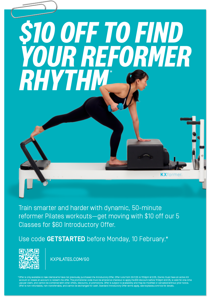
DESIGNER AT KX PILATES [2024/2025]
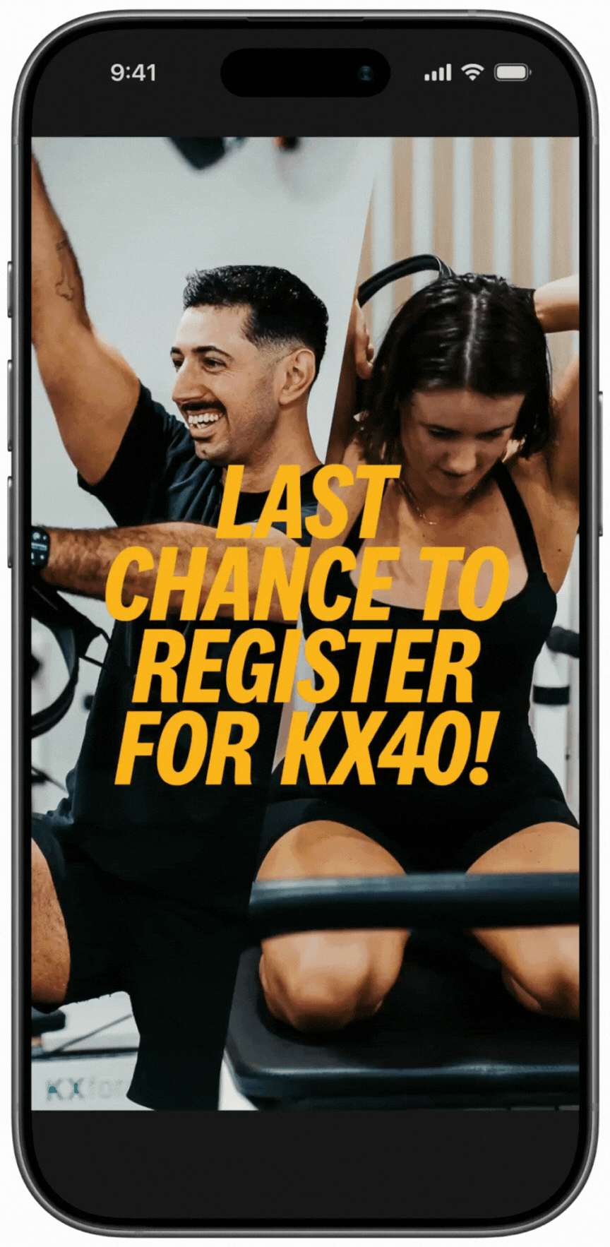
KX40 CHALLENGE [2025]
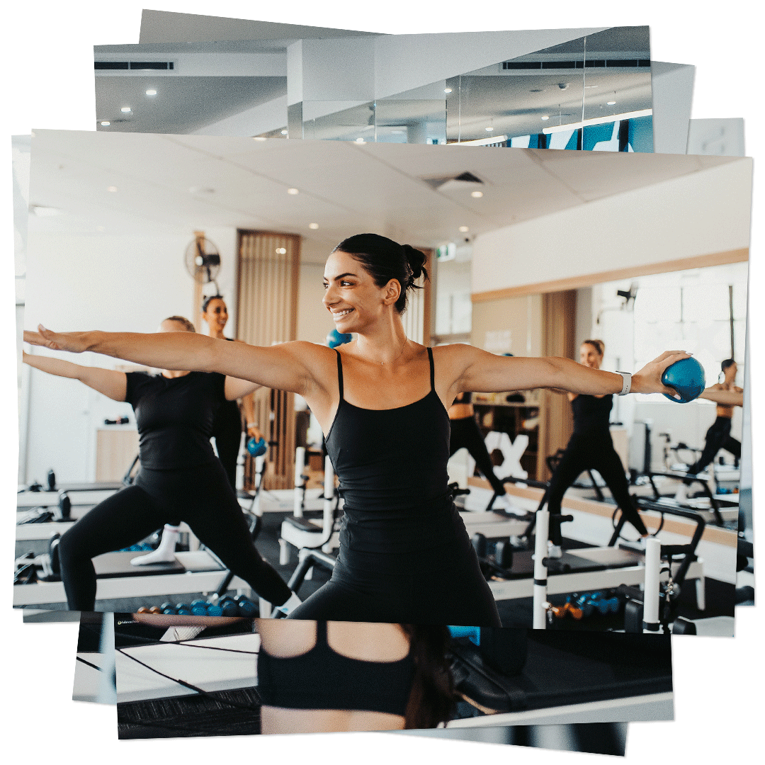
ART DIRECTION FOR KX PILATES [2024/2025]
CELLTOWERS [2025]
LIZARDS OF LEISURE [2022]
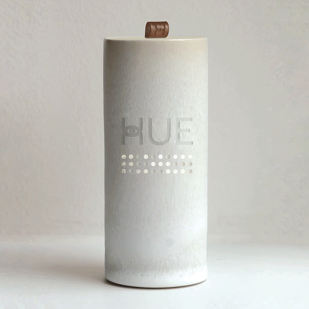
COMMUNICATION DEVICE [2020]
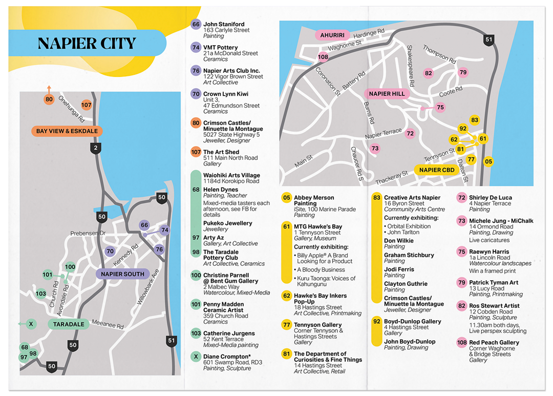
HAWKE'S BAY ART TRAIL [2021]